
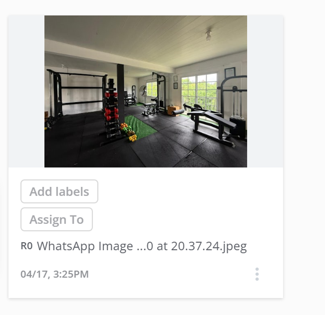
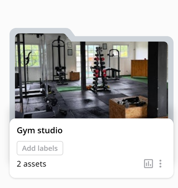
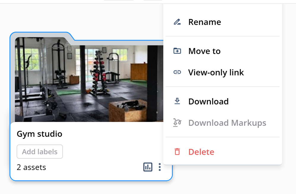
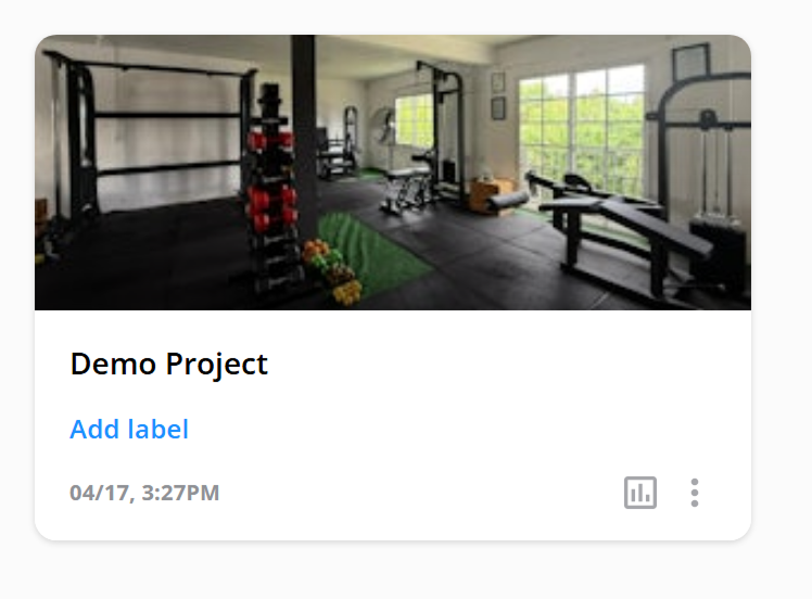
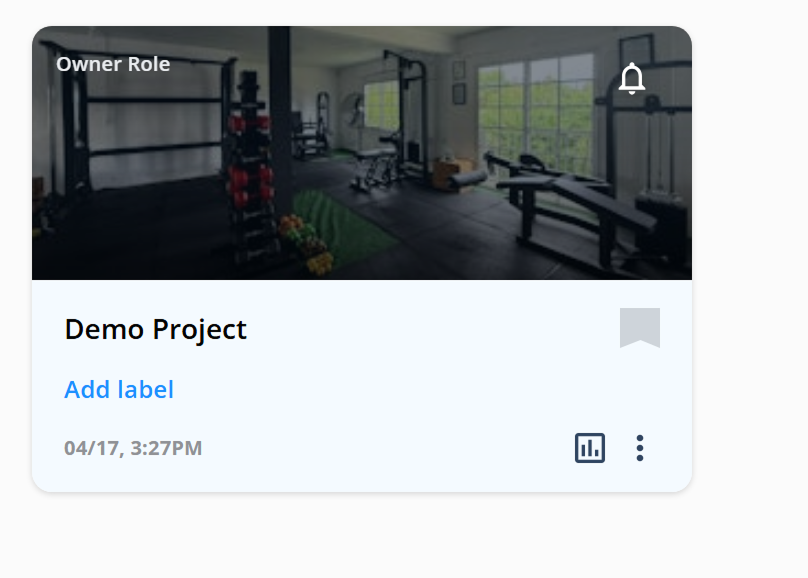
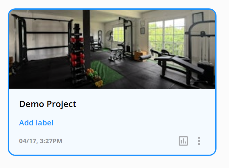
Asset
Default
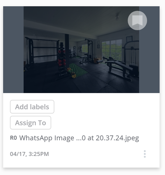
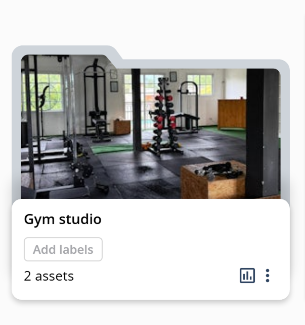
Hover
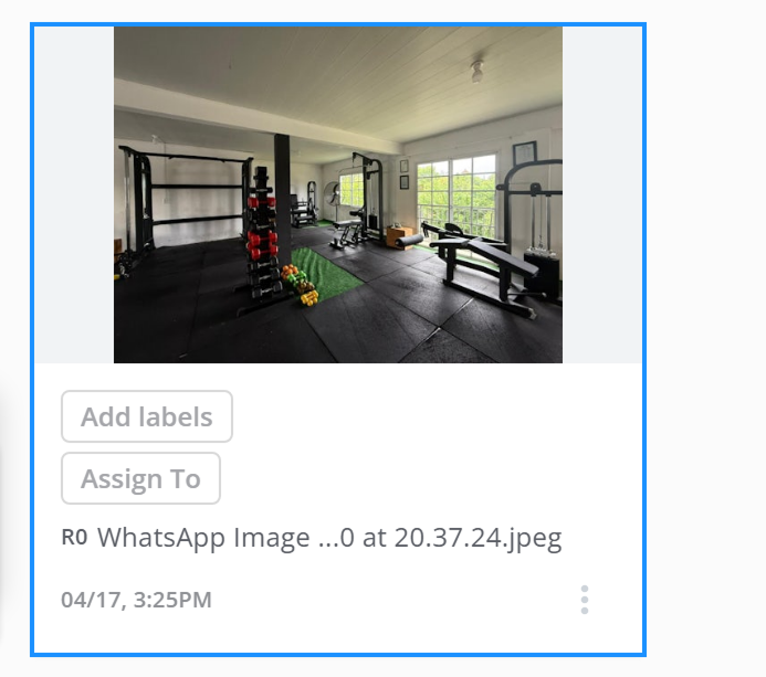
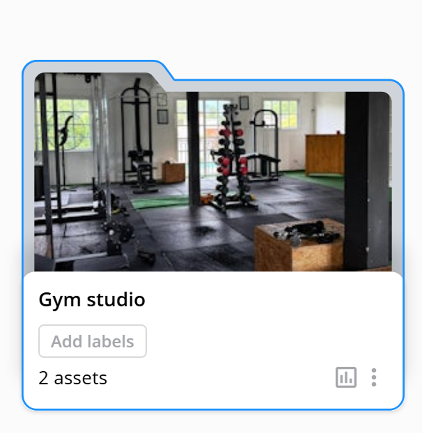
Selected
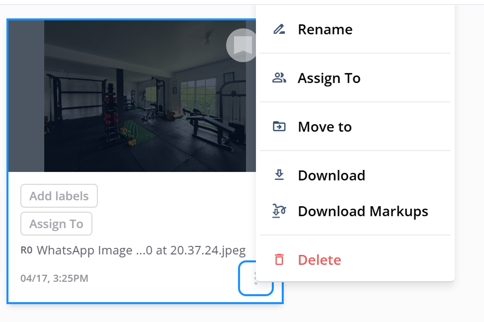
Dropdown
A year of research-driven work modernizing a SaaS platform for creative retouching teams.
Verybusy is a SaaS platform built for creative retouching teams — a space to organize assets, manage review rounds, and coordinate feedback across retouchers, photographers, and agencies.
I joined the product through Amalgama, a consulting studio, as the embedded UX/UI Designer. For a year I was the only designer on an 8-person team, working side by side with the PM, PO, and engineers.
By the time I came on, the product had been live for three years and had started to feel its age. Engagement was low. New signups were rare. The team knew something wasn't working — the question was where to start.
Verybusy was functional, but it was beginning to look outdated next to the competition. The landing page, the brand, and parts of the interface had all been built years earlier and hadn't kept up.
The team could see the symptom — low engagement, few new users — but the deeper question was harder: were we failing to reach the right people, or were we reaching them and failing to explain what we offered?
The pricing model was part of that uncertainty. There was a single "early adopter" plan with unlimited everything at $25/month. We suspected it might be mispriced, but none of us had the data to know. Everything downstream of that — the landing copy, the marketing, the positioning — had the same problem: assumptions, not evidence.

Verybusy, pre-redesign · 2022
Before redesigning anything, we needed to understand who we were actually building for.
Together with the team and a few senior designers at the agency who joined the conversations, we decided to run foundational research — not to test a feature, but to understand the day-to-day of the photographers and retouchers we were aiming at: the tools they used, what they prioritized, and what they were used to paying for.
I led 10+ in-depth interviews with photographers and retouchers in the target market, paired with a competitive benchmark of Frame.io, PageProof, Ziflow, ReviewStudio, FileStage, and other tools in adjacent categories.
Retouchers and photographers work with heavy files. When choosing tools, storage capacity came up more often than workflow features. Many relied on Dropbox for that reason alone.
When interviewees used Frame.io or similar platforms, the main driver was usually the storage tier, not the review workflow. The features we believed were our differentiator weren't the ones closing the decision.
Comparing what our plans offered against what the market charged, we realized the pricing was competitive. What was missing was the way we framed it: we weren't highlighting storage, we weren't signaling the segments we served, and we weren't making the path to trial clear.
The problem wasn't inside the product as much as it was in how the product described itself.
With the research in hand, the team aligned on a relaunch — not a rebuild — anchored in what the interviews had told us. I was part of every decision as the design lead on each piece, working with the PM, PO, and engineers to scope, ship, and iterate.
I led the brandbook end-to-end: brand heart, positioning, voice, personas, and visual identity. The output gave the team — and marketing — a single source of truth for who we were talking to and how.
Two personas anchored every downstream decision: Thomas, a freelance retoucher overwhelmed by feedback threads and version chaos, and Heather, an art director managing timelines and approvals across multiple projects at once.
Literal, photographic, earned from the research. Replaces the generic SaaS voice with something specific to the industry.
Shifted from generic SaaS language to a voice that reflects how retouchers and photographers actually talk.
With the positioning locked, I redesigned the landing page end-to-end to lead with what the research said mattered: the specific user types, the storage and collaboration benefits, and a clear path to trial.
Three dedicated landing sub-pages — retouchers, photographers, agencies — mirrored the personas so each visitor type saw their own workflow reflected back.
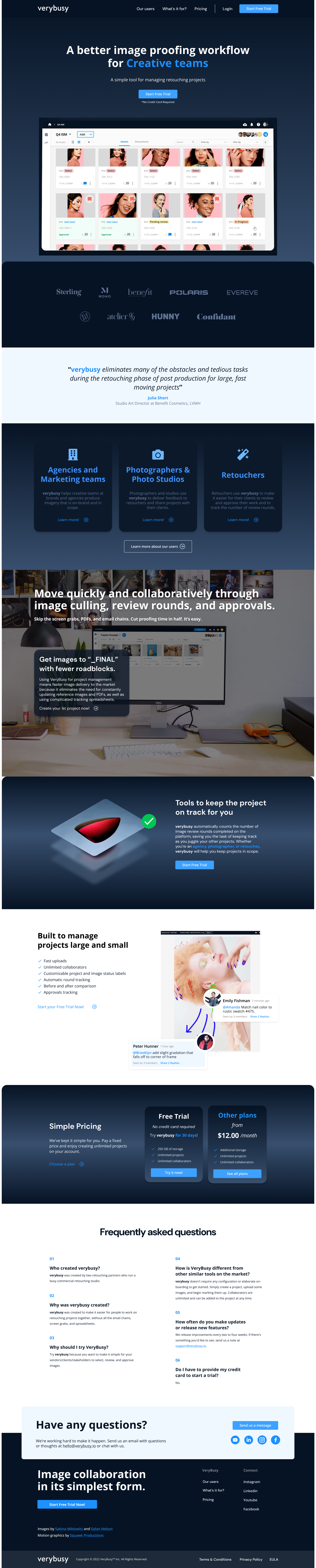
Hero video · After Effects · one sprint, solo
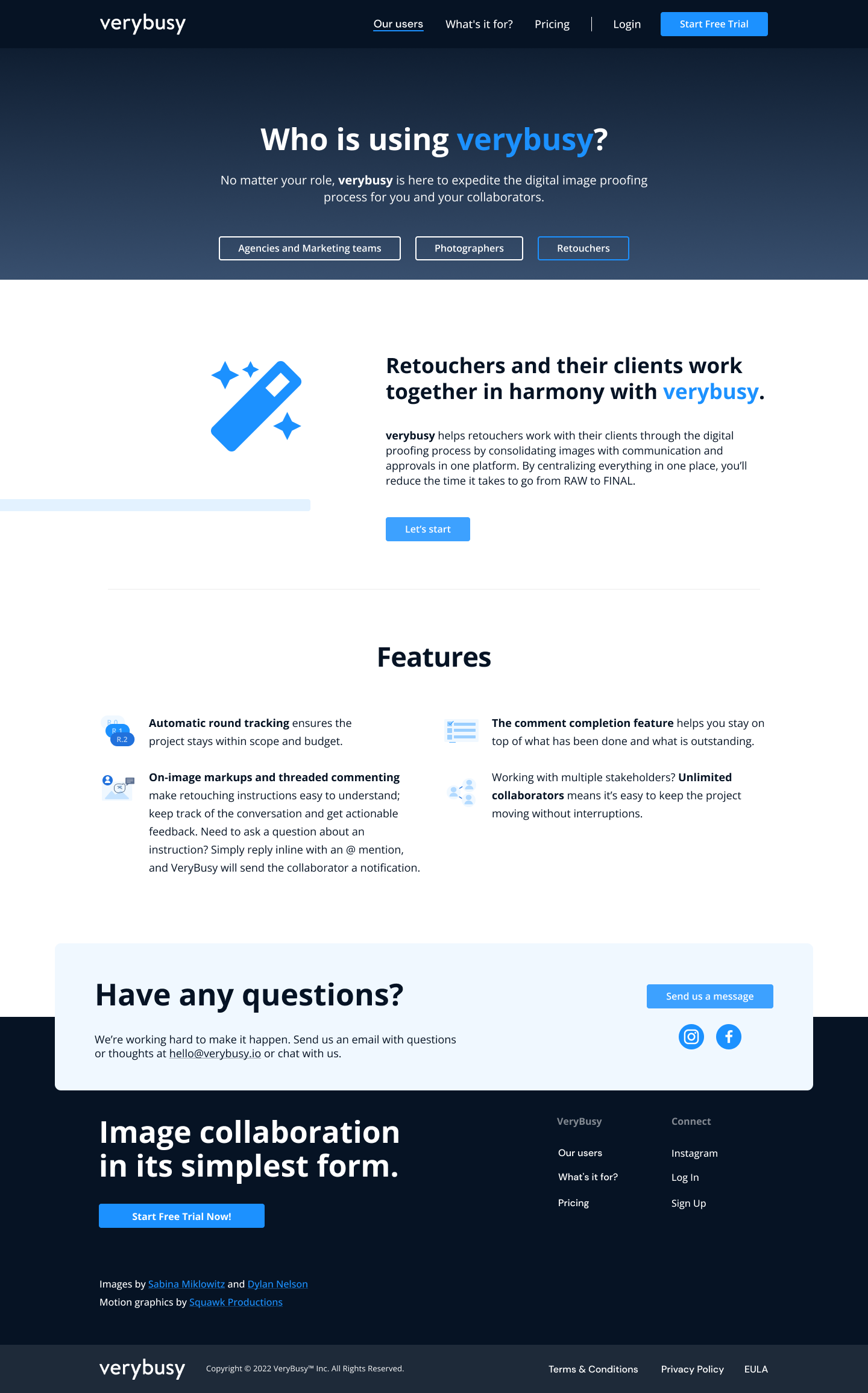
Retouchers
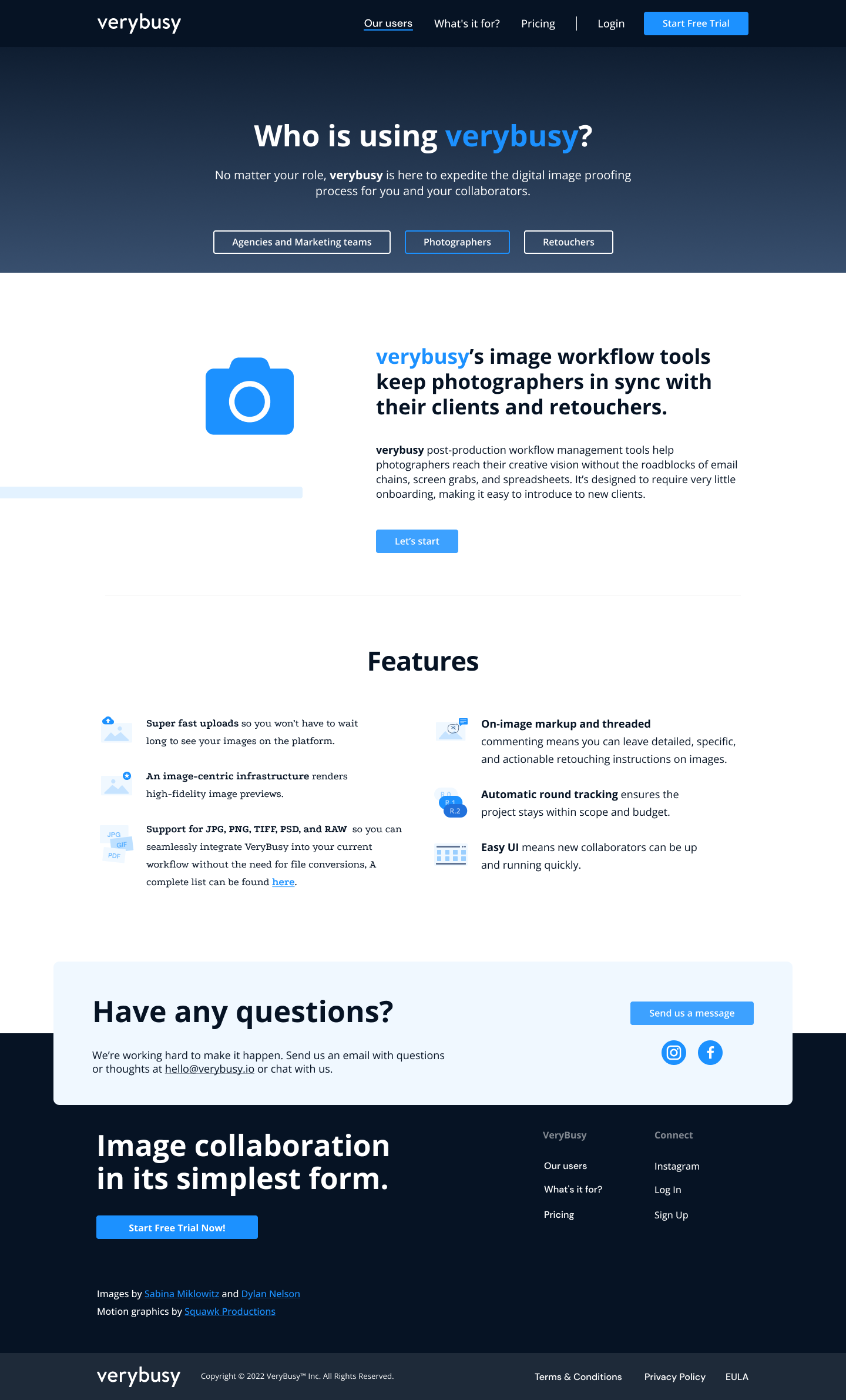
Photographers
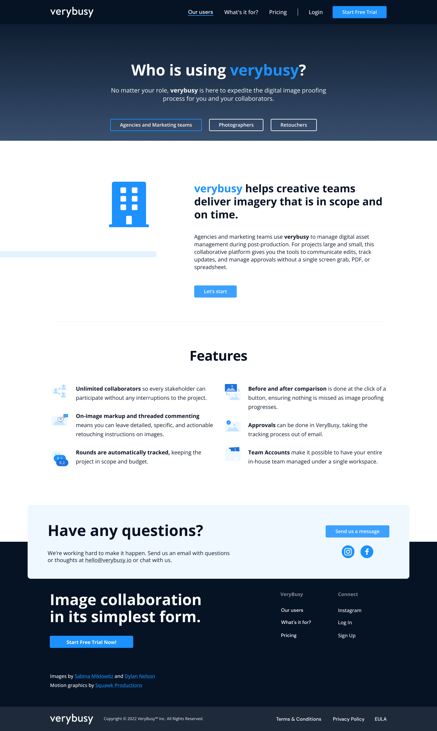
Agencies & marketing teams
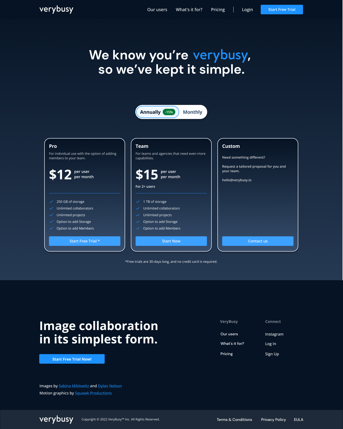
The old pricing — a flat "early adopter" plan — stayed opaque even to the team. The new model kept our prices competitive (we weren't the expensive option) but communicated tiers clearly: a 30-day free trial followed by three plans (Pro / Team / Custom) with transparent seat and storage limits and an annual/monthly toggle.
This wasn't about charging more. It was about giving users — especially the storage-sensitive ones the interviews had surfaced — a way to understand the offer.
Alongside the relaunch, I ran continuous improvements across the webapp as part of ongoing sprint work — the kind of surface you only see when you're the only designer on an active product.

Didn't exist when I joined — assets inside a project were flat and unscalable. Designed the structure, interactions, and states.
Reworked the first-time experience to shorten the gap between signup and first project.
Added asset and folder filters to handle larger workspaces.
Improved the retoucher's flow for reviewing, commenting, and resolving markups.
Modernized the UI across workspace, members, projects, and billing.
Refactored and modernized several outdated modals across the product.
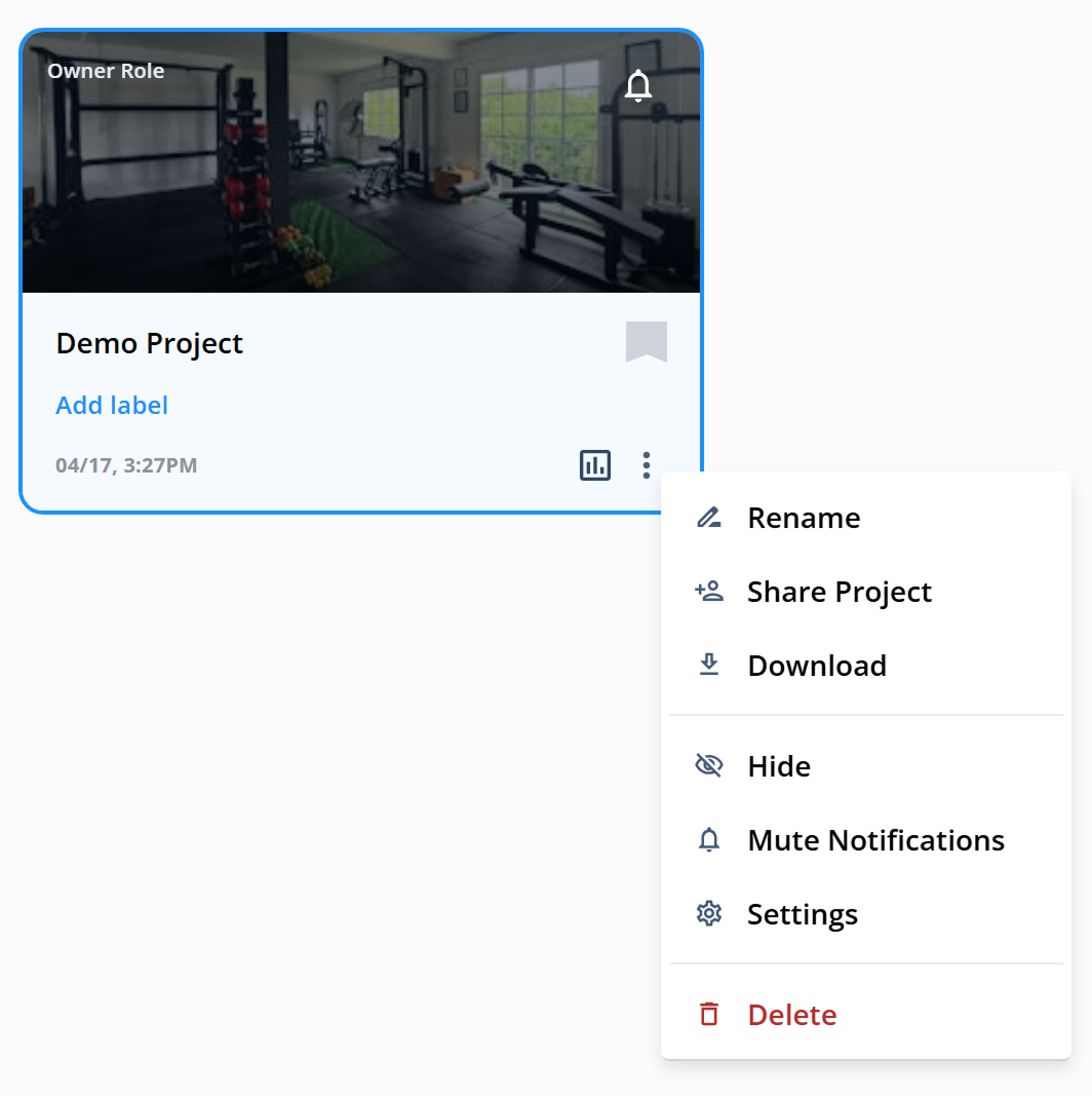
Scaled and documented the Figma component library. Each of the three core objects — Asset, Folder, Project — was built with default, hover, selected, and dropdown states, all reusable across the webapp.
The year at Verybusy reshaped how I think about design work.
When a product isn't growing, the fix often isn't inside the product — it's upstream, in how the product explains itself to the people it's for. Positioning, pricing, voice, and UI are all answering the same question: who is this for, and why does it matter to them?
When those answers are aligned, the design becomes easier. When they aren't, no amount of interface polish compensates.